Manifesto

So this is my attempt of writing about my work. This statement will be displayed next to my work for the second year exhibition, I haven’t written a manifesto before! I did read some snippets of famous ones and was particularly impressed by Walter Gropius’s (the guy who founded the Bauhaus movement) statement “The artist is an exalted artisan” when he was talking about his school, meaning that firstly you learn a craft, and then you create; much like what we’re doing on the Ceramics degree. Anyhow here goes…

Geometry is something I am especially fond of, integrating angles and lines within my artwork and using interlocking shapes to create puzzle like pieces; bringing in an element of play. I want to challenge the perception of the “normal behaviour” one should adopt in a gallery/museum setting.

Engaging the senses, with an emphasis on the physical touch is what I set out my work to do. This involves creating textures varying from smooth to rough, so one doesn’t just have a visual experience, but a tactile one too.

13329912_10153861403858649_261028492_n

This brings me to the idea of making my artwork accessible in galleries for the visually impaired, I want everyone to experience it, as we know a lot of artists do not want onlookers to touch or handle their work, fair enough, it is valuable to them and they may not want to increase the chances of it being broken. However, there are many people- such as the visually impaired- in particular the blind-who haven’t had the opportunity to experience these works as they are not allowed to touch them. I want people to touch my work as I feel touch is the most important sense…

Reflection; the end of second year is so close!

With our assessment over the next couple of days, including a presentation where I talk about my work throughout the year to Pete and Natasha, it’s slowly dawning on me that I will be in my final year of university in September! That’s only a few months away; wow. We have been asked to reflect upon our year so far, for each module… So I am going to start with our Subject module.

I thought I’d introduce my reflection with a few snaps the photographer Toril Brancher took last week of my work in the Ken Straddling Collection…

unspecified

My work perched on a stack of Arne Jacobsen chairs

unspecified-3

Close up really captures the texture of the sponged on vitreous slip!

unspecified-2

unspecified-1

I’m loving how the lacquer on the chair reflects my building blocks!

Who knew that I would be using so much colour and using children’s toys to make my work?! I am very happy with the course that my ceramics this year has taken, starting with very organic pieces sculpted and influenced by the resting positions of the body, to geometric shapes, encouraging the audience to play.

I am much more confident with where I sit in the creative realm, with the hopes of being a working artist when I graduate, informing others, through my work, the benefits art can have for us humans. With concerns to ceramics itself, I wish to do this by expanding on my casting and slab building skills and also experimenting with colour, pushing my boundaries on my knowledge of glaze and decorative slip, something which I’ve only scratched the surface of. I feel that doing more volunteering throughout the year for art events and also for charities  will help me develop professionally and more importantly it’s incredibly rewarding!

Also, I want to do some research into people’s responses to different textures ceramic pieces. After reading about several experiments-for example- whereby someone’s judgement of another’s personality whether they consider them to be friendly or competitive correlates to whether they were handling a rough or smooth object at the time of meeting them (Bargh et al 2010); I am intrigued to find out what happens when people handle ceramic oddities.


A day in Bristol

So yesterday our year group form Ceramics went to Bristol and visited the Ken Stradling gallery. This is part of a project which we started in first term… we explored Stradling’s collection and picked an item of inspiration, as a starting point, my starting point being an Arne Jacobsen chair. We took our work to the gallery to have it photographed by Toril Brancher alongside the original source of inspiration.

IMG_2146

I took this picture on the table that Jon, Fintan and Connor made during our Fo[u]r Rooms project, I think the stained scaffold planks really compliment the bright colours of my blocks, and of course, the toned down bisque terracotta brings the bright ceramic and textured brown of the wood together.

IMG_2173

Interestingly as we left the gallery, I looked across the road and there they were! More Jacobsen chairs sitting outside a cafe. We were given different time slots for our photographs, I was in the last group of people, so we had a few hours to kill, which involved browsing in a bookshop, sunbathing and eating lunch.

IMG_2205

Some new books I found from The Last Bookshop.. They buy in remaining stock so I managed to get four books for ten pounds! Bargain- I always prefer buying from locally run shops too than the massive chains, so it was a win-win!

IMG_2176

A shot taken of the Bristol uni law building… a group of us were lying on a patch of grass soaking up the gorgeous sun rays.

IMG_2196

The most wonderful tea set displayed at the Bristol Guild- which is connected to Ken’s gallery- The Viva range is a collaboration between Magpie and Sarah Campbell. What’s even  better is that the collection is eco-friendly. Who could say no to these fab geometric patterns?!

It’s a real privilege to be able to have my work photographed here, especially with such well established artists and designers work. I placed my building blocks on a Marcel Brauer desk to begin with, on the top floor of the gallery as I wanted to show in my photograph that people could touch them, and after all people sit at a desk to engage in whatever they have placed on the desk.

IMG_2179

Since my inspiration came from the Arne Jacobsen chairs, I also wanted my blocks photographed on the chairs. The action of stacking is a feature both in the chairs and my building blocks, so I placed them on a stack of 3 blue chairs. Interestingly, the colour of the chairs gave my blue building blocks the dominance, bringing a new perspective to the piece.

When Toril was taking pictures, she made some very interesting points: “The best person to photograph your work is you…Because it’s the photographs which sell your work.” And that “Whatever you do, take pictures everyday”.  Julia Donnely, who works at the gallery was saying that the biggest thing she learnt today (she was observing Toril taking photos of each of our work and also taking a few snaps herself) was that a camera will not capture what the eyes can see, as you have the working of you brain and perspective adding to what you see, so what everyone sees is different. Toril is currently editing the pictures, I can’t wait to see them next week, and to share them on here!

Vitreous Slip

IMG_2057

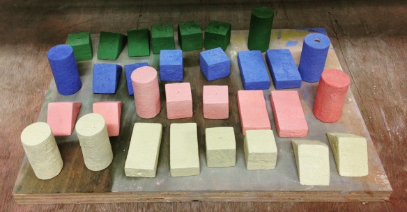
This is the same slip used, but fired at different temperatures…

(from left) 1220 degrees

1140 degrees

1100 degrees

As you can see, they have decreased in size as the properties have fused and vitrified. There is a nice waxy finish on the 1220 firing, and I would consider this a success! One thing I will say is that I wish to spray gun the slip onto my actual pieces. Brushing on the slip isn’t doesn’t produce the texture I want. I want the pieces to be (specifically for the Ken Stradling collection) tactile, and the texture just isn’t there with brush on, it looks too similar to the wooden blocks I casted!

After speaking to Matt, he confirmed by doubts of using a spray gun to decorate the small building blocks: the pressure from the air would knock them over and they would be very fiddly to spray, probably catching more water than the actual slip. He suggested I use a latex make up sponge instead and dab the slip onto my blocks.

IMG_2116

This was taken yesterday before they went into a 1220 firing! They are still in the kiln as I type, cooling down. I am going into uni today to check up on them!!! You can see they have a really nice texture, from the songs I used to decorate them. Ahhh I can’t wait to see them!

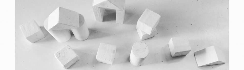
For my summative assessment I want to make variantly textured building blocks, some sanded down and ultra smooth, and others bumpy. I think 3 different textures (including my ones above) would be good, and something achievable with the time I have left before we are assessed.

IMG_2067

Interestingly, I think this texture would be a fun one to incorporate, an example of serendipity. I coated an already fired vitreous slip coated cylinder in my salmon pink glaze and then putting it into a 1220 firing. Obviously this red glaze was intended for a 1100 firing, so it blistered from the the heat, but it is certainly a bumpy texture I could use!

I wanted to do a bit of research around the chemistry of vitreous slips, mainly fascination, it really is half way between bisque fired and glazed; so I did a little research online and looked back at my first year notes from when Duncan gave us lectures on the properties of clay, from the ground up.

A flux (zinc or copper to name a few) lowers the melting point of clay, meaning that glazes and slips will vitrify (melt and achieve that glassy effect) at a lower temperature than without the flux being present. Refractory materials, such as kaolin, ball clay and flint, do the exact opposite; that being that if for example, a decorative slip matures at a much cooler temperature than the clay is has been coated on, it may require some ball clay added to the mixture so that it needs more heat (which is what the clay underneath would require in this scenario) for it to fuse.

It’s worth noting that some elements behave differently depending on what kiln firing it is. Iron, a refractory material in oxidation, is a strong flux in reduction.

Understanding the science behind clay really aids the making process. If I knew that I needed to fire my pieces at a higher temperature, I wouldn’t have had needed to book so many kilns and so as many firings! But then again, it’s second year, I have time to learn these things in place for my final year of my degree.


What am I currently doing?

After going through my blog I realised I haven’t actually discussed what my current thoughts are about the pieces I am making! I’ve been so focused on making that I haven’t stopped and reflected on the blog, instead it’s been during tutorials. So as you may well be aware, second year ceramicists at my uni are taking part in a collaborative project with the Ken Stadling Collection in Bristol. This project has been ongoing since first term back in September 2015… and my work has been on quite a journey!

It’s gone from quite sculptural, phenomenological pieces to very paired down minimalist objects.

IMG_4336

IMG_1920

I felt like my piece wasn’t complete, it needed more. After speaking to Pete, he made me realise what was missing, and what would connect my subject area with field. As I have talked about, I created a geometric puzzle out of terracotta for our field module. This then invited the audience to engage with the object, to play.

All along I felt that something was missing from my building blocks, something was needed to bring it together, so they aren’t merely just some building blocks. Pete asked… what makes these different from the wooden ones you originally casted? Well, they sound different, they clink when they touch each other, it’s a lovely sound actually. So there is an essence of acoustics. Also, the weighting varies between the same shapes. Whereas the cut out wooden blocks are solid, some of the ceramic shapes are hollow, depending on how long I kept them in the slip cast mould. And last but not least, they are ceramic, they are breakable! A breakable toy who would’ve thought?! I suppose in some way I am bringing an idea of reassurance that one can handle these objects, they can play with them. Yes, they are made of a fragile material, but, so what if they break?

However, they are still, just building blocks, I need a hook, something which invites the audience to rearrange these blocks, to take action and play. Much like I did with field, by creating a puzzle, I want to do a similar sort of thing with my building blocks.

Then Pete grabbed one of my test pieces, a large terracotta cuboid with a semi- circle cut out. I say large, it is compared to my building blocks, it’s slab built and about 10 cm in diameter. And then, he started placing my cast cylinders in the semi- circle

A game! Yes, this was the something I’d been missing!

The plan is to construct 4 of these large shapes, keeping the terracotta colour, and the rustic feel, honing on the root importance of my art- to engage physical touch, for it to be tactile and textures, a contrast to the polished cast building blocks.

Good Morning!

When I wake up in the morning I always switch the radio on and listen to Radio 1, it’s always great starting my day with music! Something I heard today on the radio which has particularly connected with so I thought I’d do a little blog post about it… On the show today, Nick Grimshaw was live in LA interviewing Calvin Harris after talking a little bit about his new release with Rihanna This Is What You Came For

He then made a really interesting point of how years ago during his first albums, they were more dancey, but he wanted to have more texture in his music so it felt more real. He then said how dance music can have the tendency to be “2D”. I think it was this reference which I can relate my work to… As much as a painting on a wall is fantastic to look at, it is still a painting on a wall, I am excited by the fact I can make 3d objects within Ceramics and I want people to experience these objects, to touch them. This is the thing which differentiates me from making 3D work as opposed to 2D.

IMG_1847

Work in Progress-Building blocks waiting to be fired. I have casted children’s building blocks and I am now creating ceramic versions of them, they will be exhibited in a gallery with the notion that the audience are welcomed and encouraged to pick them up, to handle and play with them.

What I’m trying to say is that  I am making a real object, whereas often, a painting can a depiction of an object (such as Cezanne’s still life works) which links to what Calvin was saying about using actual instruments in his music, rather than it purely being electronic. This video shows Calvin Harris performing Blame with John Newman whilst playing the piano live.

Still Life with Water Jug c.1892-3 by Paul Cézanne 1839-1906

Still Life with Water Jug c.1892-3 Paul Cézanne 1839-1906 Bequeathed by C. Frank Stoop 1933 http://www.tate.org.uk/art/work/N04725

It’s nice being able to connect with an artist from an entirely different creative path such as music, and one can source inspiration from all kinds of artwork, not just things from within one’s discipline/ specialist area. And I’m not saying there is a type of art which is more important than another, it depends on someone’s perspective, but, for me, my perspective is very 3d driven.


Ken Stradling project

When us Second Year Ceramics students were tasked to do a presentation of our development of ideas for the Ken Straddling project, I was a bit nervous as I hadn’t actually been to this collection before. The day of the presentation was my first time. Pete gave me the low-down of the project aims and I had done my research online and in books.

I guess my starting point was over summer, because we were given the collections brief then; so I did some research at the Wellcome Collection in London and the Pitt Rivers Museum in Oxford.

IMG_3371.jpg

Various bottles at The Wellcome Collection in London

I found out about the Arne Jacobsen 3107 chair in an article online by the Bristol Post and it was about this collection and it went on about how Ken bought a copy of the photograph of Christine Keeler sat in a copy the chair (the real design doesn’t have a hand grip).

IMG_4165.jpg

Stacks of Jacobsen chairs in the basement where the Ken Stradling collection is based.


It was at the Pitt Rivers museum that I looked at headrests. There’s an amazing cabinet full of them made of ceramics, made of wood and I was just absolutely intrigued by them. There are all sorts of shapes; you can see a ceramic, rectangular one which was made in Japan. It struck me how structured the objects are and they mean comfort to people; just like the chair is. And that got me thinking how your body adapts to the shape of furniture… and that got me thinking… My ideas are kind of going along the lines of phenomenology.

IMG_3243.jpg

A view from the first floor of the Pitt Rivers

Scan 100.jpg

This is a sketch I did of the head rest cabinet

IMG_3236.jpg

Various headrests, all shapes and sizes

I watched this documentary called The Tribe on Channel 4. And its interesting because it’s there that I first saw headrests and that’s what drew me to the cabinet at the Pitt Rivers museum.

And it’s interesting because in this picture you can see Ayke Muko (the tribe leader on the far right) resting his leg on one. They use them to sit on aswell, and when they go and visit other tribes and things they carry them with them much like you’d carry your mobile phone with you. So it’s that idea of comfort and familiarity.

I’ve just been playing around with clay and I like the idea how you can adjust the shape of clay with your body which contrasts with the fact that a piece of furniture can adjust your body shape.

I have started of with basics by literally printing my thumb into clay and then I experimented with pressing my friends head into a slab of clay and it’s really fun I love doing this. I wrapped the clay around her head.. . I thought that I’d get that really indented print but you don’t because the pressures very different and that’s working on a solid piece of clay.

That led me on to experimenting with making a cushion out of paper and bags and placing a slab of clay onto it and then pressing someone’s head onto it. These are the results:

IMG_3990 (1).jpg

I like the ambiguity of these, like if you saw these in a gallery you wouldn’t know that someones head had been pressed onto them.

IMG_4081.jpg

IMG_4196.jpg

Different resting positions recorded. From left: Legs up on the sofa, resting head on elbow, head and crossed legs with hands resting on them.

And then I did some more experiments at home. The picture with the hands on clay is of my housemate.  I’m looking at resting positions, I think that’s where it’s heading; that idea of comfort and resting. I just saw her sat like that on the sofa and I thought it was really interesting how she rested her hands so I said to her “Just stay there” and I put a slab of clay underneath her and I wrapped it around and her arms and the result was quite interesting. She sat there for about an hour, I made her stay there! Luckily she was watching t.v so it was fine. And I tried to keep that shape because I found that pressing into clay with a cushion underneath, you get the shape and then it bounces back up again. So it’s the idea of keeping it where it is.


Displaying Artwork

IMG_1590 The time has arrived where I must display my work! It is the most minimalist work I’ve done to date. I normally go OTT with glazes and colour, but I held back this year as I wanted to explore different avenues, like the positioning of the pieces, I’ve learnt this year (going to The Ceramics Biennal and Ceramic Arts London helped!) that the way ones work is displayed can be as important as the final piece itself. I’ve drawn from the likes of Emily Gardiner as inspiration. Her pieces have conversations with each other, meaning that the absence of one would have a tumultuous effect on the whole mood of her displayed pieces.

emily_gardiner_5

Emily Gardiner

IMG_1610

A rough sketch of what I wanted my space to look like. I always seem to do draw out area plans, no matter how big or small the space is!

IMG_1584

Bits n’ bobs

IMG_1583

Before

It’s like changing rooms.. haha. Now I feel like a 90s kid.

IMG_1603

After. It’s amazing what some multi surface wipes and a white sheet of paper can do!

IMG_1588

IMG_1589

Marc Quinn

Marc Quinn is probably most well known for his piece Self, which he exhibited in The Royal Academy of Arts’ Sensation show. It was a collection of work owned by Charles Saatchi. What was Self? Quinn made a sculpture by freezing 8 pints of his own blood in the shape of his own head. It took him 5 months to complete as he had to ‘collect’ his blood. He makes a new Self every 5 years. Self comments on the fragility of life: during exhibitions of Self, the art must be retained in a ‘freezing’ atmosphere, otherwise it would simply melt away…

But interestingly enough, I first learnt about Marc Quinn whilst flicking through Harper’s Bazaar magazine! Last season’s collections from fashion houses such as Chanel and Celine make references to Abstract Expressionism and the Contemporaries. In the March 2014 edition of Harper’s Bazaar; Play to the Gallery by Tom Allen shows clothes modelled in Marc Quinn’s studio. I am particularly intrigued by his Chromatic Labyrinth paintings. I just loved the linear quality of them and the contrast of colours and texture between each layer. It was only when I looked at the whole collection on Quinn’s website that I realised they were based on finger prints! This relates nicely to what I’m drawing from- dad’s brain scans. There won’t be another scan which will show the same image- much like we have layers of skin which make up our fingerprints, it takes layers of scans to realise the whole picture of the brain. Out of context, fingerprints and brain imagery produces very abstract shapes.

Image


Funny Shapes

These funny shapes evolved from squeezing clay and slicing it up. It’s purpose? To cross reference tension: showing the space it consumes and the forms it creates. Inspired by the globular images of my dad’s MRI scans and the whole idea of this abscess causing tension and taking up space in his brain.
I experimented with arranging these slices differently.
Some how MRI scans would be displayed- in row- not dissimilar to specimens displayed in a museum. I stacked them, hung them, coloured them in, drew around them:creating patterns. I wanted to (and still am) explore all the different avenues: I’m  pushing my project as far as it will go, then the fine tuning will commence.

IMG_1329

IMG_1330

IMG_1331

IMG_1333

IMG_1335

IMG_1337

IMG_1338

IMG_1339

IMG_1343