Expanding on colour, I am very intrigued by the calming properties green has. Since one of main aims and ideas is to enhance the mood of the audience: for them to slip into a daydream, choosing the right colours is a necessity.
I initially researched the effects of greens and blues. Green was originally introduced in hospitals to reduce the glare of traditional hospital whites. Also it is a sign of health and wellbeing: Healthy plants always have fresh green leaves.And blue is often associated with calmness, like calm waters in the Mediterranean for instance, and a clear blue sky.

Although I am not designing these tiles for a hospital, I found a very interesting study by the NHS on colour in hospitals.
The information I read can be applicable anywhere, not just in hospitals. Green also provides a high contrast environment, reducing eye fatigue caused by looking at too much red (blood). Perhaps this is why the Royal Infirmary in Cardiff decorated this space pictured above with green tiles.
It also makes red blood splashes ‘less conspicuous”. Overall, the colousr of my tiles are pretty easy on the eye, but still capture the audience’s interest through the optical illusions the tiles make up. Interestingly, the best colour for judging colour is grey, so by slotting in my marbliesed grey tiles,it refocuses one’s attention to the puce, ultramarine, celadon and prussian blue tiles.
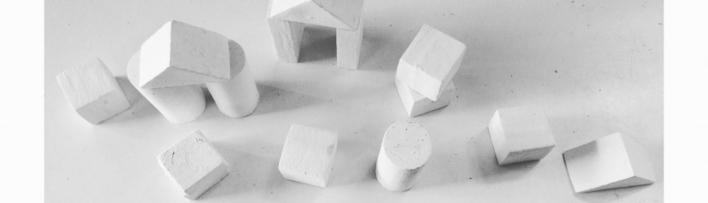
 But this did not happen. It just wouldn’t release, I used compressed air gun, water, I’d even spread a thin layer of engine oil onto the piece prior to moulding. Had it been earlier on I the year, I would have tried casting this complex shape using a different material.. But I have made an executive decision to put this aside and concentrate on making tile with the mounds I already have. I justified it with the fact that I would have to learn to use a new material such as silicon or using a CNC machine; and at the moment my knowledge lies with plaster. Time is of the essence and at this point of the year I need to go with what I know.
 On a positive note, if I hadn’t designed this shape, I wouldn’t have had my 3 separate rhombuses as a result of being the shapes pushed out of hexagon during laser cutting. Also, I am very happy with how the tiles I have are looking, so I don’t feel I need another shape in the composition anyway.


