I have been in the education system for nearly 20 years, so I would like to have a break from education after graduation. For six months I will be working full time, saving money for travelling in January 2018.
I will be going to New Zealand, Australia and Thailand, coming back to the UK at the beginning of March. This will be a massive source of inspiration for me, a complete change of natural environment compared to the UK, there will be plenty of moments I can sketch. I am especially looking forward to going on the 90 mile beach in Auckland and exploring modern architecture- such as the Opera House- in Sydney as well as century old temples in Thailand.
I am currently researching into buying a small kiln so I can start making things at home over the weekend, on my days off.
And then next year I wish to do INC space. I feel I need a year to step back in order to re-focus; and to get a detailed business plan together.
Along with this I wish to volunteer at the Pitt Rivers museum, having sent off an application to be an object handler, I am waiting to hear back from them! This will be a brilliant place to extend my contextual ceramic knowledge as well as share my passion of the material with the public.
I am exhibitng my degree work at New Designers the following month and also going to Hatfield in August. In preparation for this I have made business cards and my website will be complete on the day of my degree show ready for the public to look at.
The creativity never stops, I am continuing to make in the studio, as its essential I have enough stock for Hatfield. I am selling my tiles as table coasters. Because of their tessellating nature, customers can buy just 3 or more, and play with the composition, giving them the option to use their creativity and make interesting arrangements for their dining and coffee tables.  In the long term, it would be a dream come true to do a Ceramics residency at the V&A. About a year ago I had a really interesting chat with Amy Hughes during her open studio day. She made fantastic coil built vases, inspired by pieces from the museum. It excites me to think that I could cast century old ceramics from the V&A’s ceramics collection and use parts of them to create other objects in completely new and innovative ways.
Alos, Thomas Heatherwick is a huge source of inspiration and the projects he has done with the Heatherwick’s Studios are amazing. To have a large scale installation/sculpture in a building like he did in the Wellcome Trust headquarters with Bleigessen is the pinnacle of my goals.
 The final hurdle of level 6 was, of course, the end of degree exhibition. I must say I seem to work well when given deadlines, rather than having a seemingly never ending project. Psychologically, it’s the journey towards the end point and the satisfaction of seeing the end result and knowing all of the hard work you have put in; that’s the kick I get out of it. I think this became prominent in my Field project last year: I feel that my Fo[u]r Rooms live interior design project- led by product design lecturer Richard Morris- provided a steady framework for this and I am pointing in the direction of design rather than art. Also when it comes to presenting final outcomes, there is a level of finish I like to attain, not dissimilar to when,for example, product designers show their final designs on a clean sheet of mount board.
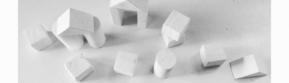
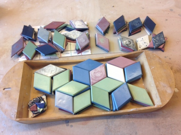 Over the course of my degree, I have learnt that my interest lies in geometries. I thrive in the satisfaction of transforming a lump of squidgy clay into a collection of angular Tessellating shapes. The manifestation of my ideas evolved from linear patterns to geometries. I began to decorate 3D slab constructed vessels with optical illusions, and was very concerned with the surface. The theme that remained the same right from the start of the year was my production of Interlocking forms. I began first by making 3D tangrams. This then of course evolved to Tessellating tiles. It was vital for me, that the tiles created an optical illusion which submerges the audience into an enhanced, dreamy mood. I am delighted at how my ideas developed as it has enabled me to go down a completely new avenue of creating wall pieces that can be both an installation in a gallery or functional bespoke tiles.
 Please click on the link below to view my final presentation


